Moving stock between terminals, part 3: does moving stock pay?
Part 3 of 3. Part 1 found the story, and part 2 found who was driving it.
Part 2 ended with two watch brands running Heathrow’s Terminal 5 in opposite ways. Watches A sends stock ahead of demand and brings 37% of it straight back. Watches B sends only what Terminal 5 asks for and brings back nothing. On stock discipline, B is the model. As before, the data is simulated, and I’ll come back to what that means for this post in particular.
The obvious next question is which of them is selling more.
The puzzle
Comparing shop sales directly would mostly compare shop sizes, so the measure here is sales per square foot. That matters in an airport, where space is the scarcest thing a brand rents. In the simulation, most watch boutiques are under 1,000 square feet, and the biggest fashion shops are about three times that.
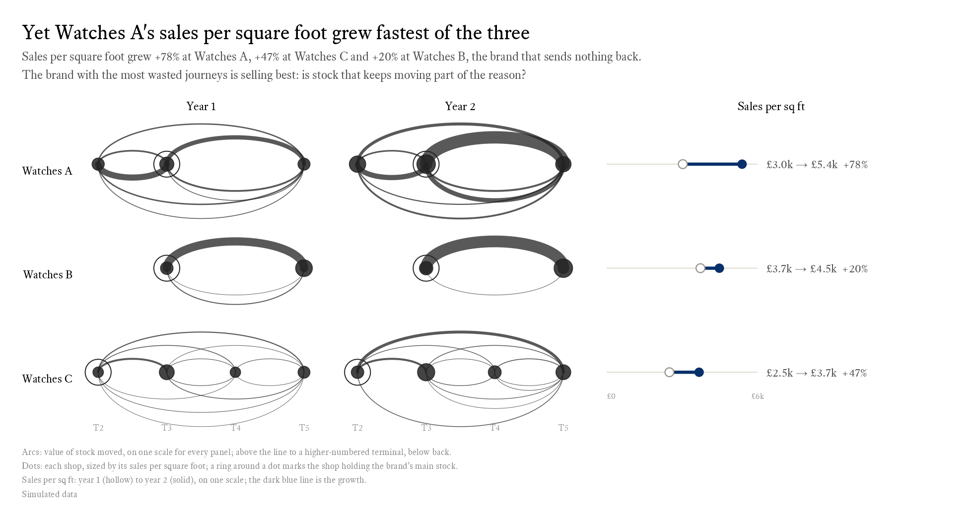
Watches A’s sales per square foot rose from £3.0k to £5.4k, up 78%. Watches C rose 47%. Watches B, the brand that sends nothing back, rose 20%: it started the year with the highest sales per square foot of the three and finished it overtaken. The brand with the most wasted journeys is selling best.
This chart narrows the view to the three watch brands, and puts the arcs back into plain ink. The red made its point in part 2. Now the question is sales.
The dumbbell is there because both ends matter. Watches B started highest, and a chart of growth alone would lose that. The line between the two dots is the only blue on the chart, an ordinary-weight line in a fully opaque dark blue, so the change is the first thing the eye finds and the dots, scale and labels stay quiet. I tried a thick line first, and it was too heavy.
I tried three other ways to show the same numbers.
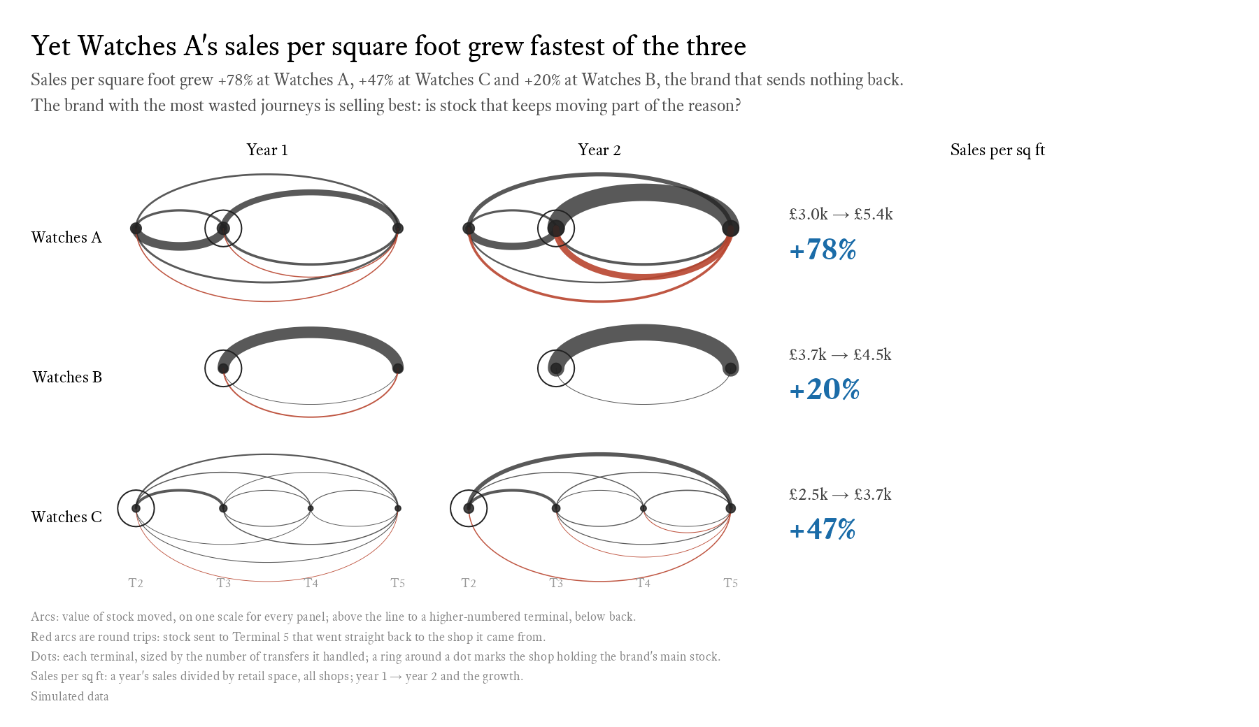
Large numbers are clear, and for three rows they might be enough. But the reader has to read the numbers and compare them, where the dumbbell lets them see the difference.
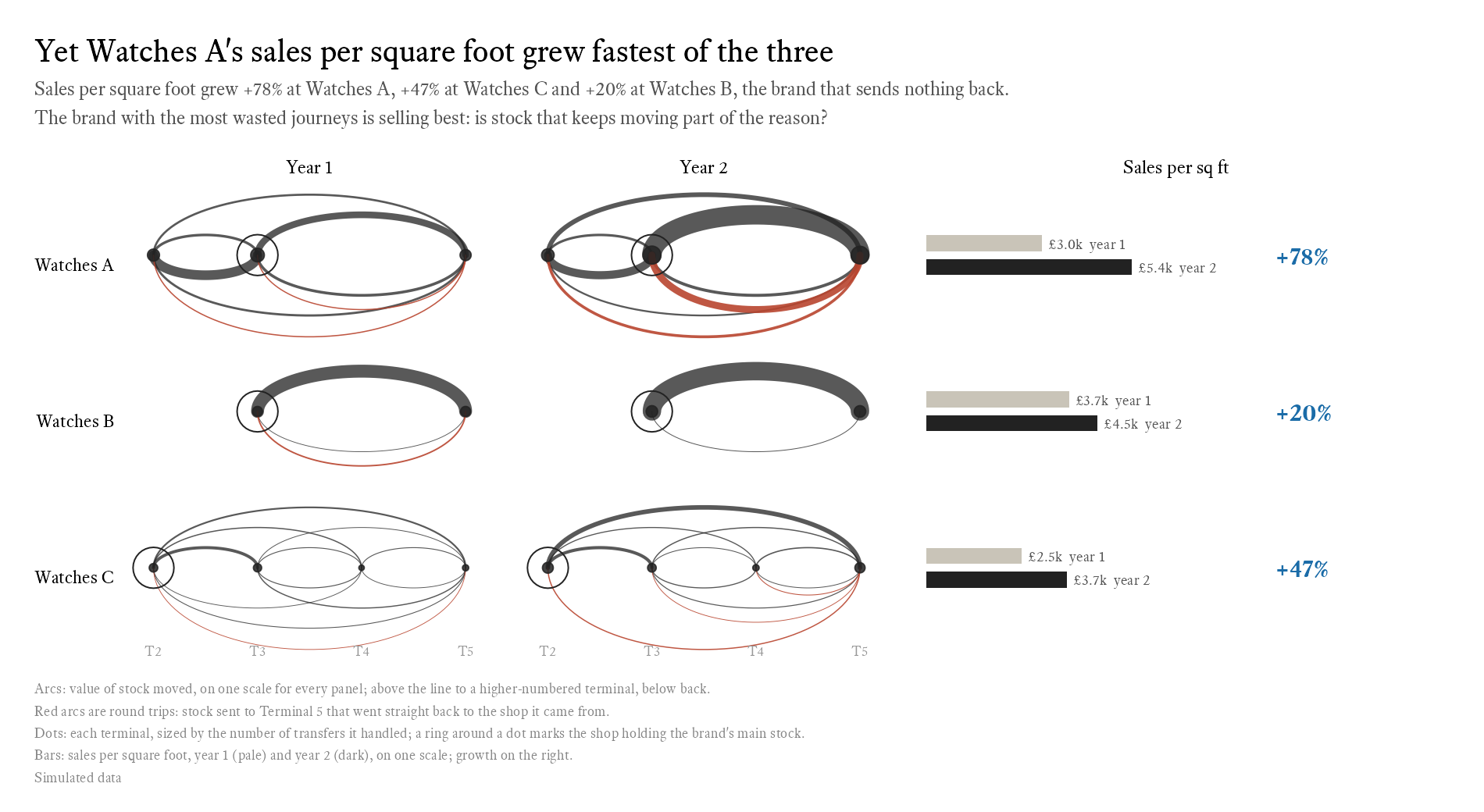
Paired bars show the levels as well as the change, but that’s two bars and a number per row, more to read for the same point.
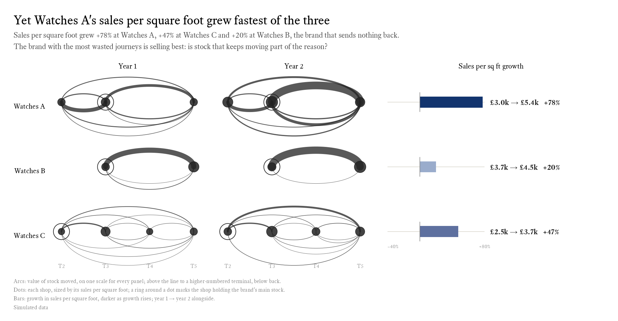
A single shaded growth bar is the simplest, and it drops the start and end points, leaving only the change. Those are the one thing this comparison can’t do without. My first version leaned on the shop dots instead, sized by sales per square foot, with only a thin dumbbell beside them. The sizes barely differed, so the eye couldn’t compare them. The dots kept their sizes as secondary detail, and the dumbbell took over.
Does it hold beyond watches?
Three brands are an anecdote. The question is whether the pattern holds across the airport: do brands that keep their stock moving sell more?
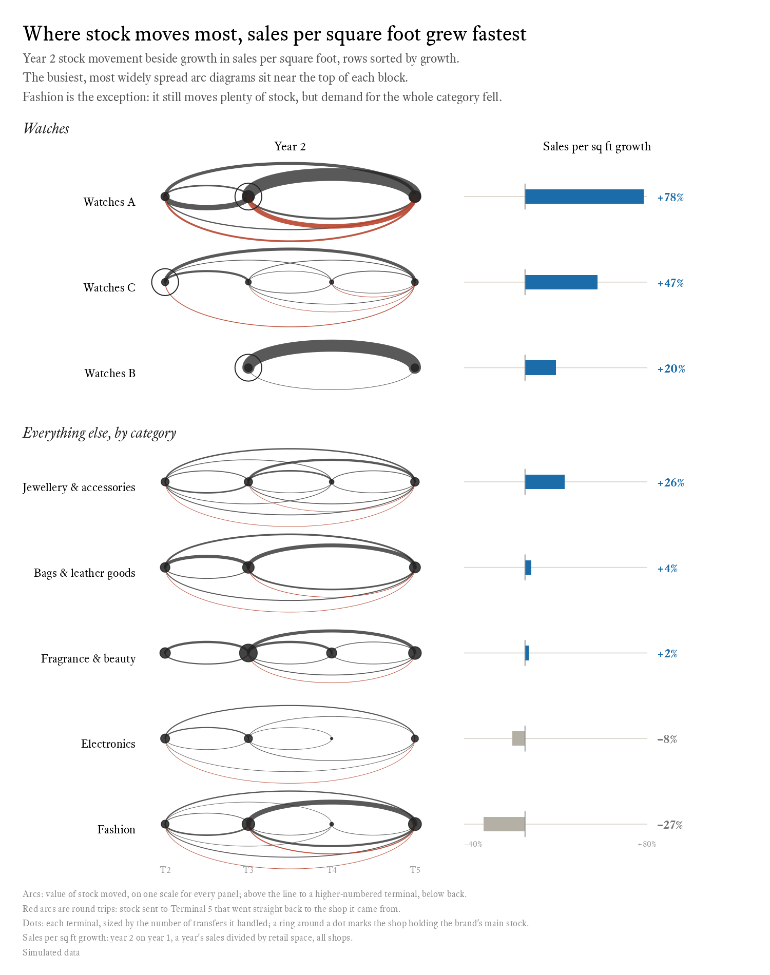
The rows are sorted by growth, so the question becomes a visual one: do the busier arc diagrams sit near the top? Broadly, they do. Watches A and C have the busiest panels and the fastest growth. Outside watches, jewellery, with arcs between every pair of terminals, grew fastest, at +26%. Near the bottom, electronics moves little stock along thin arcs, and shrank.
Fashion is the exception, and the useful one. It still moves plenty of stock, and its sales per square foot fell by 27%. Demand for the whole category fell, and moving stock around couldn’t make up for passengers who didn’t want what was on the rail.
I’d made a version of this chart with a dynamism score in a column beside the growth. It was accurate, and I dropped it, because it put the measure in front of the intuition. A reader who sees the pattern first will trust the number more when it arrives, and is better placed to argue with it.
A number for ‘dynamic’
To test the pattern, I need a number for how actively a brand moves its stock. I scored it from 0 to 100, in two halves.
- Intensity is the value of stock moved between terminals for every £1 of sales, capped at 50p. A brand moving 50p or more of stock per pound it sells scores the full half.
- Breadth is the share of the 12 possible terminal-to-terminal routes the brand used. A brand that only shuttles between two shops scores low, however much it moves.
The outcome is the growth in sales per square foot, not its level. The level would reward brands that are simply popular, or simply expensive. Growth asks whether something changed.
The score took one correction. The small multiples have one row per category outside watches, so each row needs a score. My first attempt pooled each category’s brands and scored them together. Five fashion brands between them use nearly every route, so every pooled category scored high on breadth, and the scores came out implausibly high. The fix was to score each brand on its own and take a sales-weighted average for the category. It’s a version of a familiar trap: a property of each member, like how many routes it uses, doesn’t survive being added up.
Is it real?
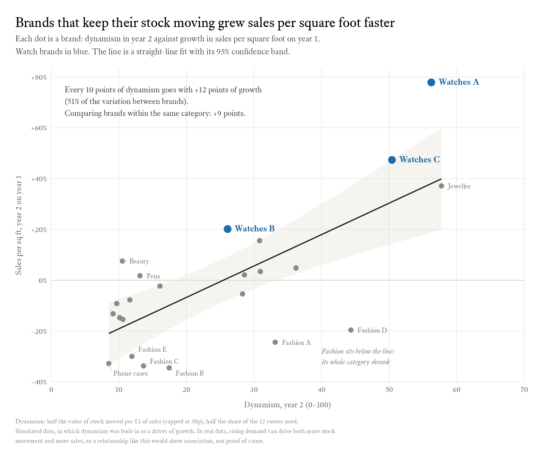
Across the 23 brands, every 10 points of dynamism goes with 12 points more growth in sales per square foot. The relationship is strong for data like this. Dynamism accounts for 51% of the variation in growth between brands, and if there were no relationship at all, a slope that size would turn up by chance less than one time in a thousand.
The obvious objection is the categories. All three watch brands sit above the line, and every fashion brand sits below it. Watches grew and fashion shrank for reasons that have nothing to do with how brands move stock, and if the more dynamic brands happen to be in the growing categories, the line might just be measuring the category. So I fitted the model again with category included, which compares brands only with others in the same category. The slope falls to 9 points per 10 of dynamism, still well clear of chance. Category explains some of the relationship, and leaves most of it standing.
Fashion shows why that check matters. Fashion D is one of the more dynamic brands in the airport, at about 44 points, and its sales per square foot fell by a fifth. Against the line, that’s a failure. Against the other fashion brands it’s the best result in the category, and the next most dynamic, Fashion A, shrank the next least. The whole category fell; within it, moving stock still seems to have helped.
What this does and doesn’t show
The effect is built in. This is the caveat that matters most, and it’s why I’ve been careful to say the data is simulated. I wrote the relationship into the simulation:
g = exp(category_trend[category] + 0.9 * (score / 100 - 0.25) + rnorm(n(), 0, 0.04))
Each brand’s growth is its category’s trend, plus a term in its dynamism score, plus some noise, all on a log scale. Ten points of dynamism multiply a brand’s sales per square foot by about 1.09, roughly 9 points of growth, and the within-category regression found 9 points. The pooled +12 is larger because it also picks up the category trends I set: watches were set to grow and fashion to shrink, and the watch brands are among the most dynamic. So the regression recovers what I put in. That shows the method works. It doesn’t show the effect exists in any real airport.
With real data, causation could run either way. Rising demand can cause both more stock movement and more sales: a brand that’s selling well has more requests to fill. Comparing within categories helps, but it doesn’t settle it. A stronger test would ask whether a brand’s dynamism in year 1 predicts its growth in year 2, so that the cause comes first.
The weights are a judgement call. Half intensity and half breadth, with intensity capped at 50p per pound, is a choice I made, not something the data told me. Before trusting the result I’d want to see that it holds when the weights change.
Round trips cost money. Watches A’s approach works in this simulation, and each of those journeys still takes someone’s time, a slot on a delivery run and a risk of damage. If the conclusion is that Watches B should be more willing to send stock ahead of demand, the recommendation needs a price for the extra journeys next to the extra sales.
What the charts taught me
Across the three posts, a few rules held.
- Titles state the finding, and they’re calculated from the data, so they stay true when the data changes.
- One accent colour per chart, used for the story. Everything else is grey or ink.
- One measure throughout: the value of stock moved. Counts only appear as dot size, where workload is the point.
- The same order everywhere: Terminals 2 to 5, and watches before everything else.
- Shared scales across small multiples, so panels can be compared at a glance.
- Remove before adding. Annotations, halos, a second accent colour and labels on the charts were all tried, and all removed when they added noise.
- Captions explain the encoding; titles and subtitles explain the meaning.
- One symbol, one meaning. The hollow dot meant year 1, so the main-stock shop became a ring.
- Emphasis by contrast, not weight. An ordinary line in a strong colour against muted grey beat a thick bar.
- Check the claims. Subtitles were softened where the data only broadly supported them, and the slips were fixed: a ‘–0%’, and a minus sign in the wrong place in ‘£-363k’.
How it’s built
The dynamism score is one function:
dynamism_score <- function(moved, sales, routes) {
  100 * (0.5 * pmin(moved / sales / 0.5, 1) + 0.5 * routes / 12)
}
It’s applied brand by brand, which is the fix for the pooling mistake. Category scores are a sales-weighted average of those:
brand_scores <- transfers |>
  summarise(moved = sum(value), routes = n_distinct(paste(from, to)),
            .by = c(retailer, category, year)) |>
  left_join(summarise(sales, sales = sum(sales), .by = c(retailer, year)),
            by = c("retailer", "year")) |>
  mutate(score = dynamism_score(moved, sales, routes))

row_dynamism <- brand_scores |>
  mutate(row = row_of(retailer, category), block = block_of(category)) |>
  summarise(score = weighted.mean(score, sales), .by = c(block, row, year))
And the two fits are one line each, the second adding category:
fit_all <- lm(growth ~ score, data = why)
fit_cat <- lm(growth ~ score + category, data = why)
The full script simulates the data and draws every figure in the series. It needs R 4.1 or later with dplyr, purrr, tidyr, scales, ggplot2, patchwork, ggrepel, circlize and ragg. The fonts come from two variables, sans and serif, which you can point at any faces you have installed. The seed is fixed, so it reproduces every number in all three posts.