Moving stock between terminals, part 2: who is moving the stock
Part 2 of 3. Part 1 found the story, and part 3 asks whether it pays.
Part 1 ended with a table and a slopegraph that both said the same thing: Terminal 5 now receives 56% of all the stock moved between Heathrow’s terminals, and what it received grew 38% in a year. The data is simulated, as it is throughout this series, but it’s built to behave like the real thing.
Summing by terminal made that easy to see, and it hid who was doing the sending. A terminal doesn’t move stock; a brand does, and only between its own shops. A brand with shops in Terminals 3 and 5 can send stock between them and nowhere else. So the data is really 23 small networks, one per brand, laid over the same four terminals. To see who is behind the flow into Terminal 5, I need every brand’s shops on the page at once.
Every shop on one line
An arc diagram puts every node on a single line, so the labels all run the same way and stay readable. I’d started with one (it was the chart part 1 took apart), and I rebuilt it to fix what was wrong.
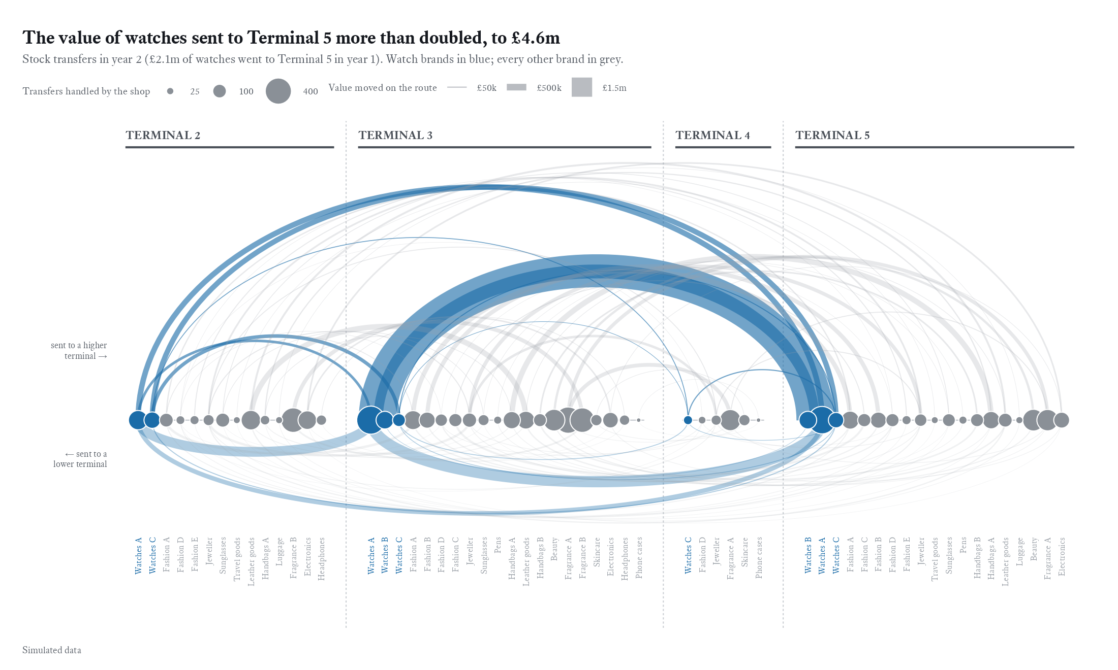
Each dot is one brand’s shop in one terminal. Within each terminal the shops follow the same category order, watches first, so a brand sits in roughly the same place in every terminal and a reader can follow it along the line. Arcs above the line carry stock to a higher-numbered terminal and arcs below carry it back. The ones below are flatter and fainter, because the story is about what goes up into Terminal 5.
Four decisions shaped it.
- Arc width is the value moved on the route. In my first version it was the number of transfers, which made cheap goods sent often look as important as watches. I changed it after asking what an arc was supposed to mean to someone reading it. The answer was money.
- Dot size is the number of transfers the shop handled, sent and received together. That’s workload, and it’s worth seeing next to the money: a shop with a big dot and thin arcs is spending a lot of someone’s time on cheap items.
- There is one accent colour. Watch brands are blue, and every other brand is grey. I tried blue for watches and orange for fashion, whose demand falls in the simulation, and two stories at once was too busy for one chart.
- The terminal splits are plain. Each terminal has a labelled heading rule, with dashed dividers between them. I tried shaded bands, and then large terminal numbers set behind the arcs. The arcs covered the numbers.
There are no annotations on the chart itself. The title says what to see: the value of watches sent to Terminal 5 more than doubled, from £2.1m in year 1 to £4.6m. The thick blue arc from Terminal 3 is where it went.
Brand by brand
An arc diagram of the whole airport is good at showing where the weight sits. It’s poor at comparing one brand with another, or one year with the next. For that I switched to small multiples in Edward Tufte’s style: one row per brand, the same small chart repeated, serif type, no boxes, and notes in the margin.
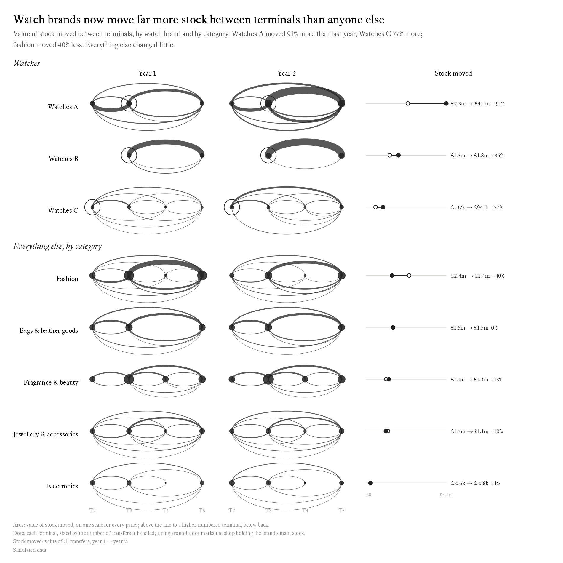
The three watch brands get a row each. Every other category is one row, because five rows of fashion brands were clutter that told the same story five times. Every arc panel shares one scale, so a thick arc means the same thing in every row and the panels can be compared at a glance.
The ring took a correction. A brand usually keeps its main stock in one shop, which sends far more than it receives, and I wanted to mark it. My first mark was a hollow dot. But a hollow dot already meant year 1 in the column on the right, so the chart used one symbol for two meanings. Now every terminal dot is solid, the main-stock shop gets a ring around it, and hollow only ever means year 1. It’s a small change, and a careful reader no longer has to stop and work out which hollow dot is which.
The numbers sit in the last column. Watches A moved £2.3m of stock in year 1 and £4.4m in year 2, up 91%. Watches C was up 77% and Watches B 36%. Fashion fell by 40%, and everything else barely moved.
Round trips
Not all of that movement is useful. Stock sent to Terminal 5 that doesn’t sell there tends to come back to the shop it came from. I call these round trips. In real data you’d flag them, so they can be separated from ordinary restocking, and the simulation flags them too.
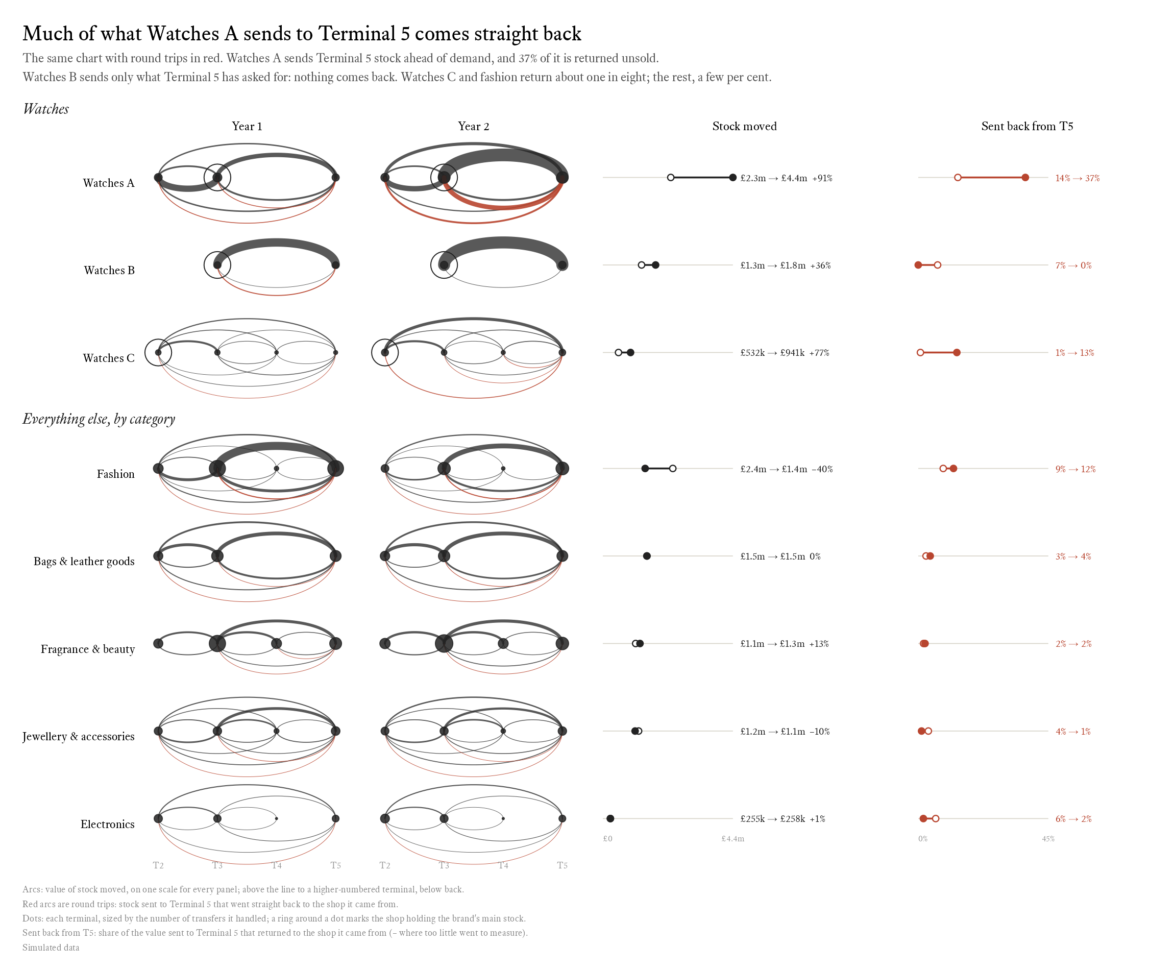
Watches A now sends back 37% of what it ships to Terminal 5, up from 14% the year before. Watches B went the other way, from 7% to nothing at all. Watches C and the fashion brands send back about one in eight, and the rest a few per cent.
The two biggest watch brands are running Terminal 5 in opposite ways. Watches A stocks it ahead of demand: it sends stock in case someone asks for it, and brings home what didn’t sell. Watches B sends only what Terminal 5 has asked for, so nothing comes back. On stock discipline, Watches B wins easily.
I had to correct this chart’s subtitle once. An earlier version said every other brand sent back ‘a few per cent at most’. That was true of most rows but not of fashion, at 12%, or Watches C, at 13%. The subtitle now names them.
The bug the red arcs caught
The red arcs also caught a bug. A round trip is a transfer to Terminal 5 with its ends swapped, so in an early version I wrote:
transmute(year, retailer, from = to, to = from, value, category, returned = TRUE)
It looks like a swap, and it isn’t. transmute(), like mutate(), works through its arguments in order, and each one can see the columns made before it. By the time it gets to to = from, from has already been overwritten with the old to. Every return became a trip from Terminal 5 to Terminal 5, with no length, and an arc with no length draws nothing.
What gave it away was the chart: the red arcs I’d built the data to produce weren’t there, and two totals that should have agreed didn’t. The fix swaps the ends through temporary names:
transmute(year, retailer, back_from = to, back_to = from, value, category, returned = TRUE) |>
  rename(from = back_from, to = back_to)
It’s an argument for drawing the data early, and for building in a pattern you know should appear.
How it’s built
The rebuilt charts use ggplot2 only. Every arc is a list of points worked out by hand and drawn as a path. Each shop has a position x along the line, and an arc is half an ellipse between two of them:
k_up <- 0.55    # arc height per unit of half-span, above the line
k_down <- 0.22  # and below it

arcs <- routes |>
  pmap(\(id, x_from, x_to, up, ...) {
    theta <- seq(0, pi, length.out = 90)
    r <- abs(x_to - x_from) / 2
    side <- if_else(up, 1, -1)
    tibble(id, x = (x_from + x_to) / 2 - side * r * cos(theta),
           y = side * r * sin(theta) * if_else(up, k_up, k_down))
  }) |>
  list_rbind()
An arc’s height depends only on how far apart its two shops are, so height carries no data, and it’s free to be used for something else. Squashing the arcs below the line to less than half the height of those above is what makes the stock coming back read as quieter than the stock going up. The width comes from a column still called n, a leftover from when arcs counted transfers rather than adding up their value.
Drawing the arcs myself is also what made the small multiples possible: the same function draws every panel, at a shared scale, and patchwork lays them out alongside the measure columns. The full script has the rest.
Next: does it pay?
So far Watches A looks like the brand to worry about. It moves the most stock and wastes the most journeys, sending more than a third of what it ships to Terminal 5 straight back. Watches B looks like the model to follow.
Except that Watches A is the brand selling best. Part 3 looks at sales, and asks whether stock that keeps moving is part of the reason.
Inspiration
The arc diagrams in this series started with Gaston Sanchez’s arcdiagram package for R. My first version, the one part 1 took apart, was drawn with its arcplot() function, and the rebuilt charts keep its layout: every node on one line, with arcs above it and below it. I moved to ggplot2 when I needed the same diagram many times over, on a shared scale. The data-to-viz page on arc diagrams is a good short guide to when the form works.