Moving stock between terminals, part 1: finding the story, then telling it
Part 1 of 3. Part 2 asks which brands are moving the stock, and part 3 asks whether it pays.
Once passengers at Heathrow are through security, they stay in their terminal. Someone flying from Terminal 5 will never walk past the shops in Terminal 3. If the Terminal 5 shop doesn’t have the watch they want, the same brand’s shop in Terminal 3 can send one over, and the sale happens if it arrives before the flight leaves. Passengers can’t move between terminals, so stock has to.
That movement leaves a record: every transfer, with the brand, the two shops, the date and the value. Data like that raises good questions. Which terminals are stockrooms for the others? Which brands move the most? Does moving stock earn its keep? I can’t share the real data, so everything in this series comes from a simulation: 23 made-up brands in six categories, with 59 shops across Terminals 2 to 5, over two years. I built it to behave like the real thing, and I built a story into it. None of the numbers are real.
The series follows that story through three questions. This post finds it and tells it. Part 2 asks who is driving it. Part 3 tests whether it matters. Each step is also a lesson in choosing a chart, and the first lesson is the chart I started with.
Where I started
My first attempt was an arc diagram. Every brand’s shops sat along one line, grouped by terminal, with an arc for each route between two shops of the same brand. I coloured each arc by how much the value sent along it had changed on the year before: green for up, red for down.
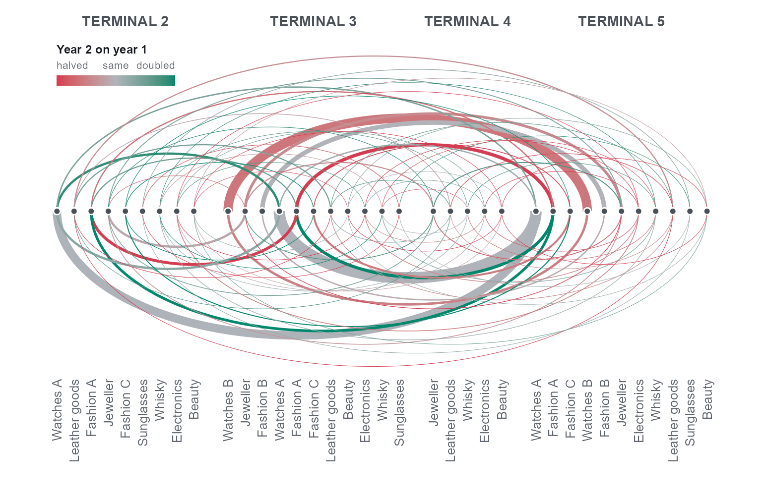
The code behind it was careful. Each label was drawn once, so the text stayed crisp. Change was on a log scale, so halving was as red as doubling was green. The key sat in a corner the arcs could never reach. The chart still didn’t work, and none of its faults were in the code:
- It had no headline. Nothing told the reader what to look at. The rules for reading it (arcs above the line go to a higher terminal, dots count transfers, width is value) lived only in comments in the script.
- The brands were in a different order in each terminal. Following one brand across the airport was the main thing a reader needed to do, and the chart made it hard.
- It was a hairball. Around 80 faint arcs merged into grey haze.
- Every route was coloured. Small routes swing wildly from year to year, so the boldest colours were mostly noise. One of the strongest arcs on the chart, a route that fell by a third, came purely from chance: nothing in the simulation changed for that brand. And red against green is the pair colour-blind readers most often confuse.
So I started again, and this time I looked at the data before deciding what to say about it.
Looking before telling
Four terminals make sixteen possible routes, including four that can’t happen, since nothing is sent from a terminal to itself. That’s few enough for a table. An origin–destination matrix puts the sending terminal down the side and the receiving terminal along the top, and every cell can carry its exact value.
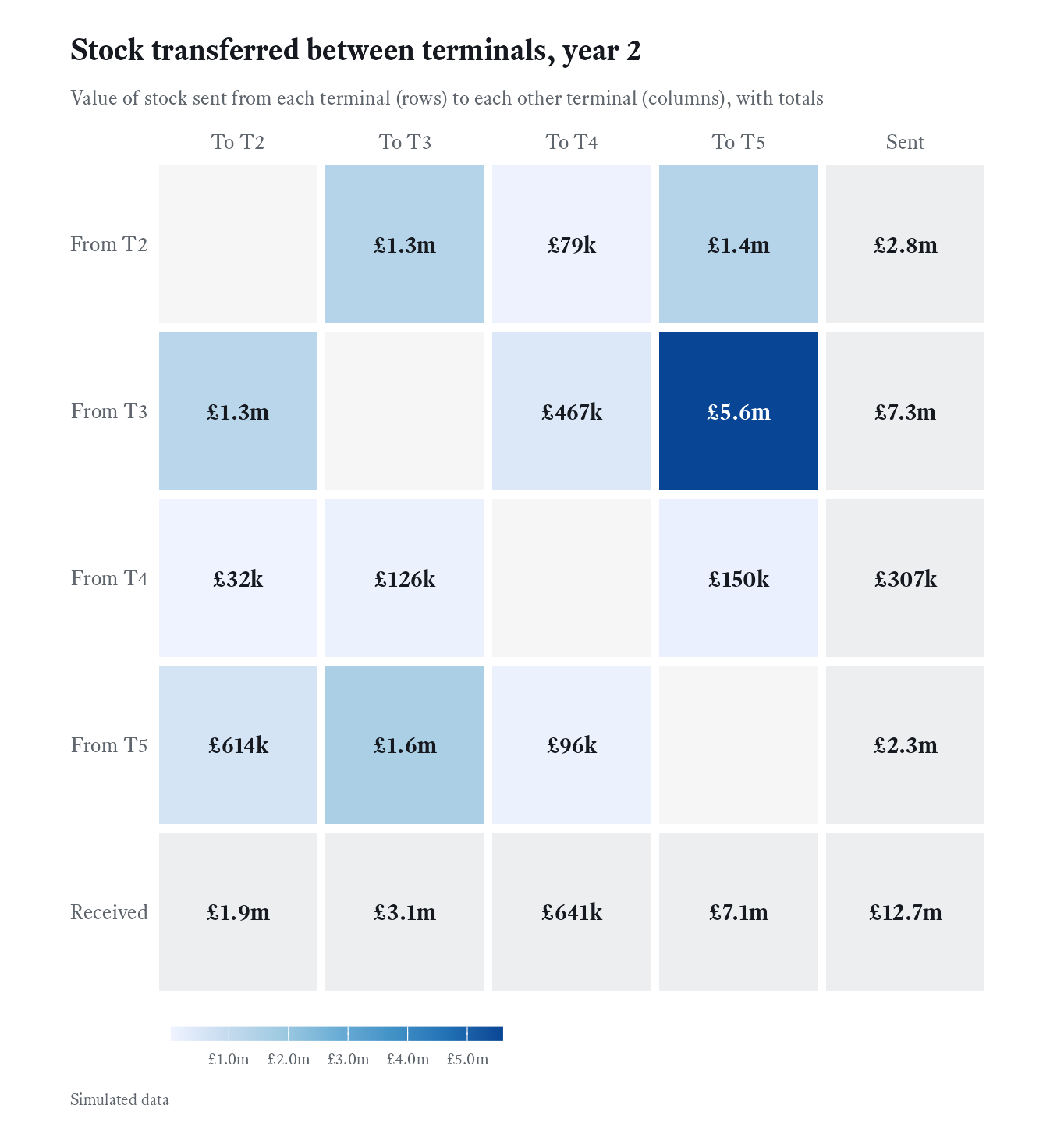
This version is deliberately plain: one blue scale, and no cell singled out. The terminals run 2 to 5 on both axes. An earlier draft put Terminal 5 first in the rows, because I already suspected it mattered, and I dropped it: the order should be the natural one, and the same on both axes. The title only describes the chart, because at this stage there’s no story to state.
A chart for exploring shouldn’t tell the reader where to look, and this one doesn’t need to: one cell is far darker than the rest. Terminal 3 sent £5.6m of stock to Terminal 5, and the Terminal 5 column holds £7.1m of the £12.7m moved in the whole year.
Telling it
Here is the same grid, with one change of purpose.
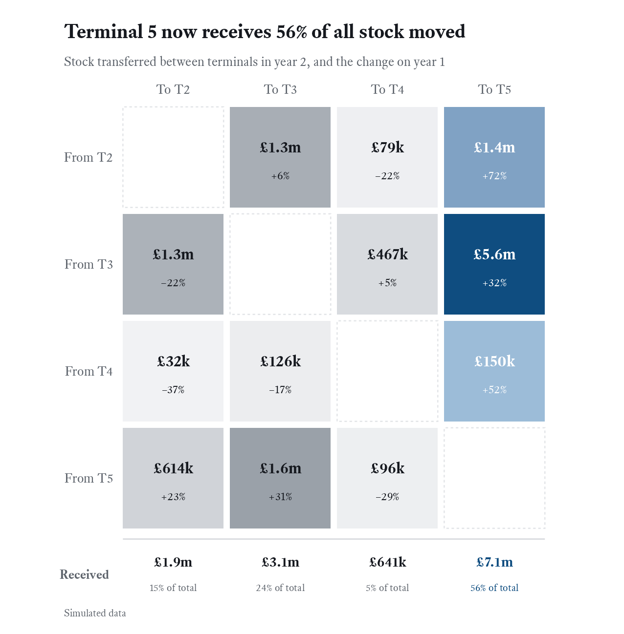
Only the Terminal 5 column is in colour. Every other cell is grey, shaded by value, so the rest of the table is still there for anyone who wants it. Each cell now carries its change on the year before as well as its value, and the bottom row turns each terminal’s total into a share. The title states the finding: Terminal 5 now receives 56% of all stock moved.
Everything sent to Terminal 5 grew: by 72% from Terminal 2, 32% from Terminal 3 and 52% from tiny Terminal 4. All the stock moved between terminals grew by about a fifth, so Terminal 5’s share rose from just under half to more than half.
The two figures hold identical data. The first is for finding the story and the second is for telling it, and the difference is four decisions: one colour, a change on the year in each cell, shares along the bottom, and a title that says something.
The fancy version
Flows between a few groups are the classic case for a chord diagram, and it’s hard to resist one. Each terminal takes a slice of the circle, and ribbons run between them, as wide as the value moved. I drew year 2 with each ribbon ending in an arrow at the receiving terminal and coloured by how much that route had changed: blue for growth, orange for decline.
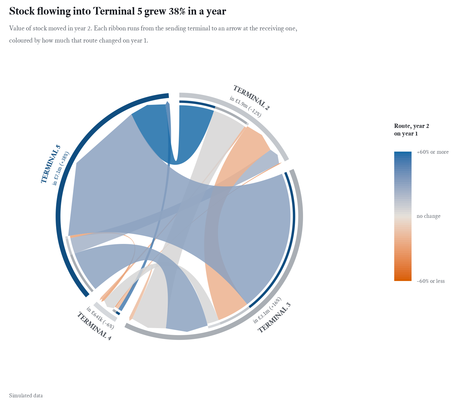
It looks good. It’s also harder to read than the table. Width carries size and colour carries change, and the reader has to combine the two in their head. Sizes are judged as angles round a circle, which people do badly. Terminal 4 shrinks to a sliver whose ribbons are too thin to see. And the exact numbers, which the matrix gave for free, are gone.
I tried several ways to rescue it. Two chords side by side, one per year on the same scale, meant comparing the sizes of two circles, which is harder still. A chord of the change alone, showing only the extra stock moved on each route, gave a sharp headline:
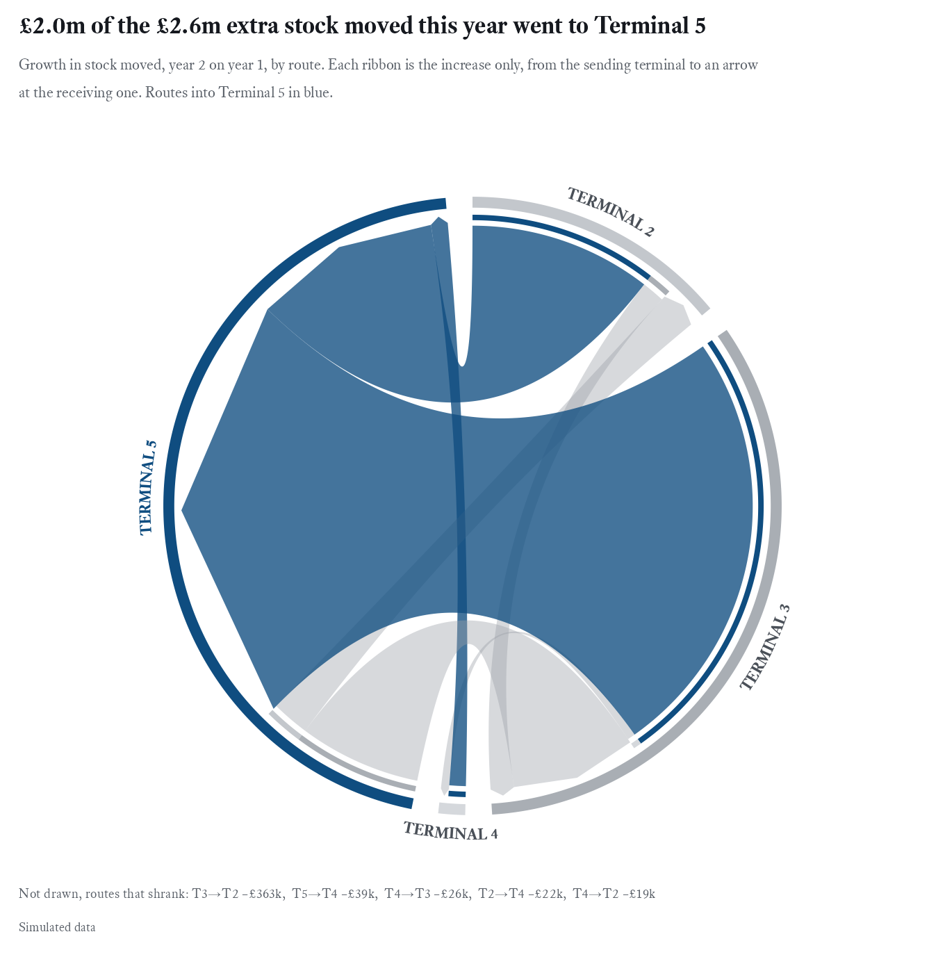
But it’s still a chord, and it can only draw growth. A ribbon can’t be negative, so the routes that shrank had to go in a list of text at the bottom. Stacked bars, splitting what each year’s Terminal 5 received by where it came from, were easy to read:
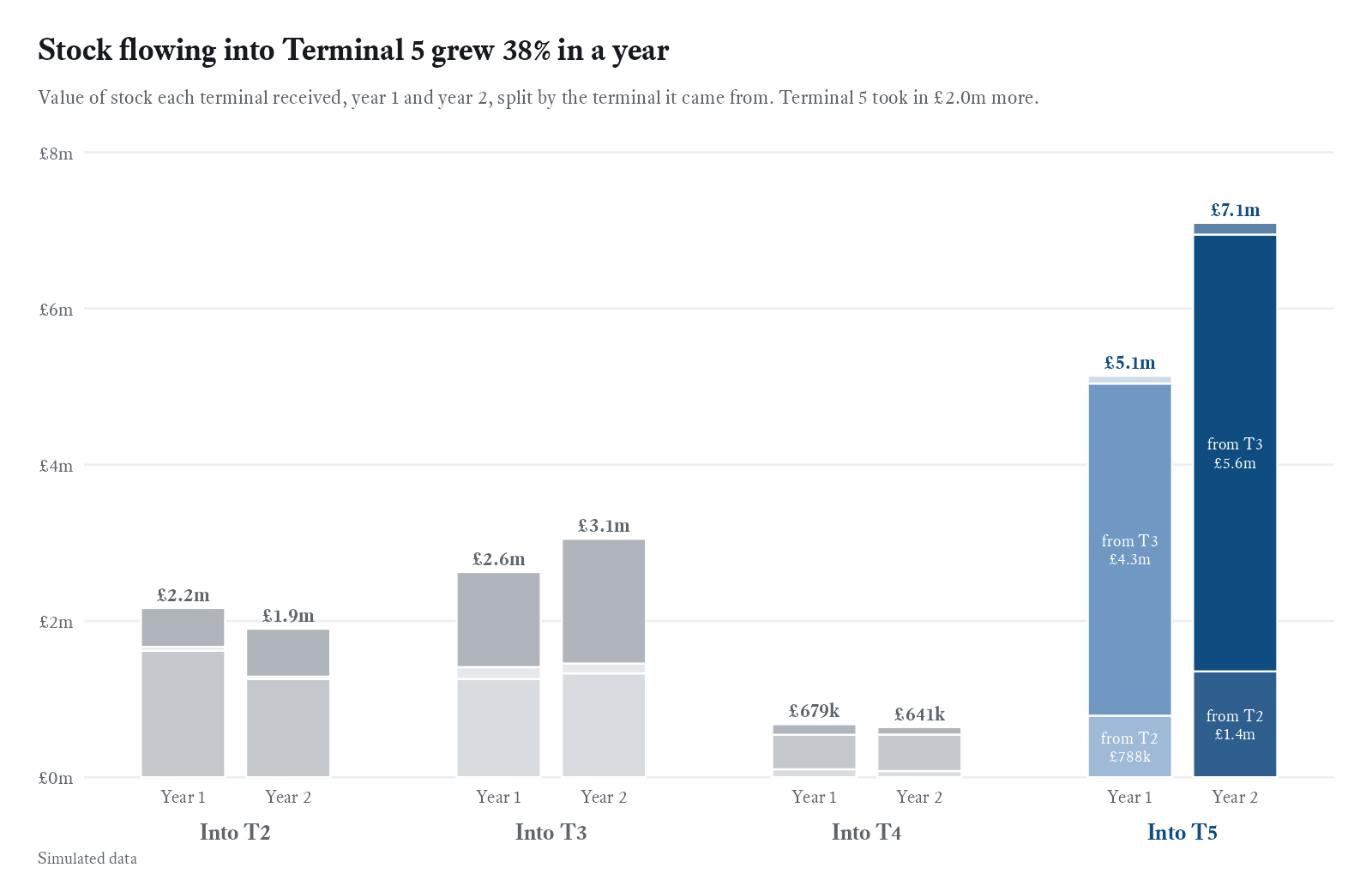
But they answer a second question, where the stock came from, before the reader has taken in the first, which is how much more there was.
The plain version
The story is one number for each of four terminals in each of two years. That’s a slopegraph.
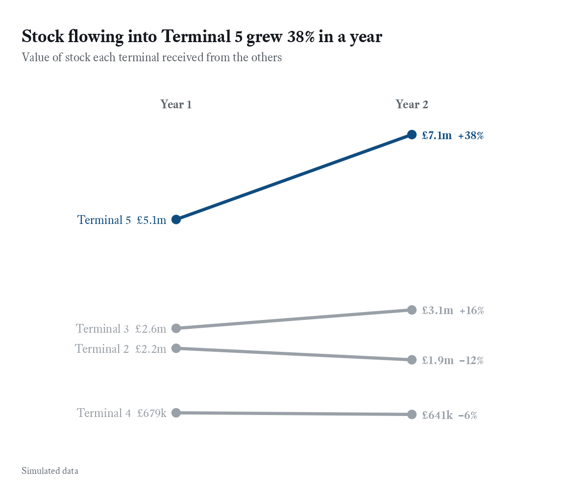
Four lines, one in colour, each labelled where it ends, so there’s no legend to decode. Stock flowing into Terminal 5 grew from £5.1m to £7.1m, or 38%, while the other terminals moved between –12% and +16%. It took the least effort of anything in this post, and it’s the chart I’d put in front of someone with thirty seconds to spare.
The chord stays in this post as the chart not to reach for first. It isn’t wrong, and with a dozen groups and no need for exact values it can earn its place. But with four terminals the matrix said everything it said, more precisely, and the slopegraph said the headline in a glance.
How it’s built
Everything in this series comes from one R script. It simulates the data and draws every figure, using dplyr, tidyr, purrr, ggplot2, patchwork, ggrepel, scales, circlize and ragg on R 4.1 or later. The random seed is fixed, so it reproduces every number here.
The matrix starts as one row per year and route, widened so the two years sit side by side. complete() adds the four impossible routes back in as empty cells, which keeps the grid square:
od <- transfers |>
  summarise(value = sum(value), .by = c(year, from, to)) |>
  tidyr::pivot_wider(names_from = year, values_from = value, names_prefix = "y",
                     values_fill = 0) |>
  tidyr::complete(from = c("2", "3", "4", "5"), to = c("2", "3", "4", "5")) |>
  mutate(
    change = y2 / y1 - 1,
    focus = to == "5",
    # then the cell labels, and the order of the axes
  )
The title of the story version is calculated from the data rather than typed:
title = paste0("Terminal 5 now receives ", round(100 * t5$share2),
               "% of all stock moved")
While I was building the simulation I changed it many times, and a typed headline would have gone stale without anyone noticing. A calculated one stays true, or at least stays consistent with the chart beneath it.
Next: who is sending it?
The matrix says most of Terminal 5’s stock comes from Terminal 3. But terminals don’t send stock. Brands do, and each one can only send it between its own shops. Summing by terminal made the story easy to see and hid the people driving it. Part 2 goes back to the arc diagram, rebuilt, to find out who they are.